IF YOU WERE to make a graph charting the level of ‘busy-ness’ of design on the Ireland rugby shirt over the years, it would somewhat resemble an inverted square-root symbol – a long straight line, a sharp spike and then a levelling-off again
Until 1993, there was little extra on the shirt apart from the shamrock-shield crest; the inclusion of makers’ logos was followed by bolder and bolder statements as professionalism – and commercialism – took hold, but recent years have seen technological advancements mixed with a classy minimalism.
The lime green trim of the current offering, coupled with white-and-red Vodafone logo, may not be the optimal elements one wants to see, but they certainly make for an upgrade on the excesses of the past decade or so.
The IRFU’s current kit contract with Canterbury Clothing Company of New Zealand was signed in 2014 and estimated at €22m over six years. This followed a €40m arrangement with Puma which had been scheduled to run from 2009 to this year, only to be ended prematurely, albeit with a pay-off from the German company.
It’s a far cry from Ireland’s first kit deal with O’Neills, announced just over 40 years ago.
On 11 January, 1977, The Irish Press reported – in a single-column piece on the side of its back page – that O’Neills had agreed to provide a full set of kit to the IRFU for each game for free.
Previously, Lawsons Outfitters of MacCurtain St in Cork had provided the kit and “each international got a jersey from the IRFU, but if he lost or traded a second jersey in the same season, he had to pay for it”. O’Neills had been in competition with another Cork firm, Three-Stripe International – adidas’s Irish licensee – but the fact that they were a native Irish company was in their favour, as well as Three-Stripe seeking the placement of the adidas logo on the shirt as well numbers in the distinctive adidas style.
Exactly 10 years after that – January 11, 1987 – the Sunday Independent carried the news that Three-Stripe had finally managed to convince the IRFU of its worthiness, with a three-year term agreed, beginning with the upcoming Five Nations Championship and taking in the inaugural World Cup. While the financial arrangements weren’t revealed, it was announced that all of the money received would go to a charitable trust for injured players.
Presumably, the key factor in the IRFU accepting the approach was that only players’ shorts and not jerseys would carry the adidas trefoil, though it would be on replica shirts sold. While France had the three-stripe motif down their sleeves, it would never appear on an Ireland kit. Donal Lenihan’s new autobiography features a picture of part of the letter received by players travelling to the Rugby World Cup in ’87, expressly forbidding the wearing of clothing made by anyone other than Three-Stripe and detailing the gear which would be received – two training suits, one pair of boots, one pair of training shoes, one all-weather suit, one kitbag for gear and one pair of white shorts.
By the time of the 1991 World Cup, the kit was pretty much the same, except for the disappearance of the adidas logo – the International Rugby Board banned makers’ logos on shirts at the World Cup until 1999, and they wouldn’t be permitted on shorts or socks again until the 2011 competition – but a slight change was around the corner.
In September 1992, Umbro became the IRFU’s kit partner in a three-year deal worth IR£400,000, though the photocall at Lansdowne Road to showcase the new gear wasn’t to the taste of The Irish Press’s Karl Johnston: “Just imagine it – a fashion show in the hallowed precincts of Lansdowne Road, the oldest rugby stadium in the world. That humming sound you may have heard yesterday surely was caused by the founding fathers of the Irish Rugby Football Union spinning in their graves!”
Umbro’s logo was on the shirt, but the only other cosmetic change was the addition of a small green triangle at each side of the collar and, in any case, the marriage proved to short-lived. By the autumn of 1993, Umbro – under new ownership, who wanted to return the focus to soccer – negotiated a termination and Nike, who had kitted out the Lions that summer and had just opened a new Dublin base, took over. The deal was estimated to be similar the Umbro one.
Nike would remain for six years, straddling the march into professionalism, though there remained a restraint on design – the addition of black trim to the collar placket for the 1999 World Cup was as far as they went.
They did, however, produce an alternative kit – white with green sleeves, and navy shorts – for the home game with South Africa in 1998. Ireland hadn’t hosted the Springboks since 1970, while Australia’s switch from green to gold shirts in 1961 removed another need for change jerseys. A noticeable difference during Nike’s tenure was the addition of the logo of Ireland’s first sponsors, Irish Permanent, under the famous Nike tick from 1996-99 and then on the stomach in the first year of Six Nations in 2000.
By the time the autumn internationals came around that year, Ireland were clad in Canterbury. News first broken by George Hook in the Sunday Independent in January of 2000, it was confirmed in March that they had outbid Fila for the contract, offering IR£900,000 per year for five years. Their first kit was plain, albeit in a more muted, less emerald shade. It would take until the summer of 2001 for any accoutrements to be added – two white stripes at the end of each sleeve wasn’t too much cause for concern, in any case. That was the look seen at the 2003 World Cup in Australia, with white side panels added to the shirt in 2005 as rugby regalia began to become more popular with the public. With Irish Permanent having merged with TSB Bank, the logo on the front changed to permanent tsb.
Hand in hand with the upsurge in sales was the quest to help kit aid performance, so much so that makers began to offer different versions of jerseys – fans could buy replicas of what was worn on-field, or opt for something which looked similar but which still had the classic rugby feel. The 2007 World Cup illustrated this vividly, with most countries following the lead of England and France from 2003 with skin-tight tops and ‘grip tape’, allowing for better ball-handling.
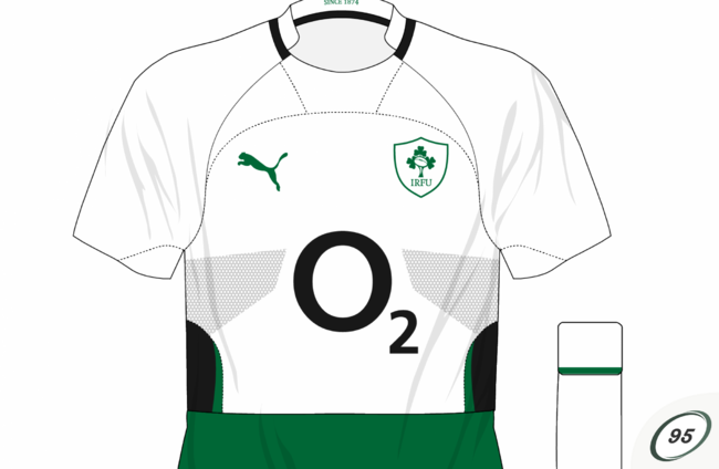
Having kept things respectable for their first seven years, Canterbury went overboard for this competition – Ireland’s green was darker, the traditional collar was dispensed with and white trim abounded. Proof, though, that a bad kit doesn’t necessarily inhibit a team was that Ireland wore this in 2009 – the logo of O2 now graced the shirts – when winning the country’s first grand slam since 1948.
That summer saw the move to Puma as the German firm made inroads into rugby. Their first kit was fine – not great, not awful – but the special commemorative shirt for the first game at the Aviva Stadium, against South Africa in 2000, was a disaster.
Puma’s marketing spiel was that they had “produced a kit that features a traditional look and ‘cotton’ feel, while using ultra-modern fabrics and construction techniques which give the kit the strong and lightweight high performance demanded by today’s players”. While the green was of a retro shade, we don’t recall Jack Kyle or Willie John McBride playing in kits with white flashes on them, and the shirts themselves began to rip, with Ireland switching to their usual tops for the second half.
Their next strip, for the 2011 World Cup, had something resembling a speech bubble by the collar and two large hexagons on the chest, while the arrangement of the grip tape for what would prove to be their final shirt, in 2013, was said by some to represent a cat jumping out of the way of a car crash. Puma also mixed things up with the change kit, though Ireland’s wearing of all-black against South Africa in 2012 arguably provided less differentiation than the normal green would have.
With their rugby dalliance cut short, Puma exited and Canterbury returned, while Three’s takeover of O2 meant another change in sponsor’s logo. The new shirt launched in 2014 lasted barely a year before receiving a facelift for the 2015 World Cup, and Vodafone replacing Three saw the need for another change. Joining the new green kit was yet another bold departure with the alternative – though it has yet to be worn, Ireland have a purple and navy number in the kit room.
The PR blurb said that the new shirt focused on the “heritage surrounding Irish rugby”: “Taking inspiration from Lansdowne Road, the oldest rugby ground in the world and the historical home of the IRFU, four gold bar tacks link to the embroidery on the original Lansdowne caps.”
The choice of purple wasn’t mentioned and, if we’re honest, we know why – it’s just to give consumers a choice.
A far cry from O’Neills giving the IRFU free gear.






The 2009 kit that we won the grand slam in is my favourite Irish rugby jersey. Loved the shape of the numbers on it as well.
I remember back in 2002 when I was 14 you couldn’t buy a kids rugby jersey I think I was in every sports shop in Dublin but couldn’t get one how times have changed
Always love a jersey made by puma personally
That’s when all rugby jerseys became tight fitting and became modern
Puma Gear Class to be fair!
Adidas would be nicer
The Puma off-field gear was the best by a mile, polos, tracksuits and jackets were on point. The playing kit not so much.