


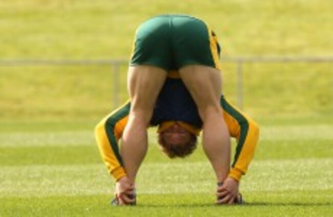
BETWEEN A FLURRY of injuries and chaining himself to diggers, David Pocock’s unrelenting ability to pilfer ball has been a little bit forgotten in the world of rugby.
As we entered the World Cup back in 2011, Pocock was arguably the best openside around and the semi-final clash v New Zealand was very much billed as ‘David v Richie’.
As well as that, his quarter-final performance in Australia’s narrow win over South Africa was so destructive at the breakdown that there were chalk outlines all over the pitch showing where he had gotten away with murder.
Unfortunately for Pocock, knee injuries in 2013 and 2014 saw him lose his place in the Australian team to Michael Hooper, who is an equally tigerish flanker. However, Pocock has been playing close to his best this season and his latest display against the Blues indicates that it might be a good balance to have the Brumbies man at seven and his ‘Tahs rival at six.
The game is shifting more and more to playing 6.5′s at openside rather than out-and-out groundhogs like Pocock, and it really is sublime to watch someone latch onto the ball like a leech.
Hopefully Pocock can continue his resurgence and make an impact at the World Cup. The tournament will be far better for it.


quite like the old crown paints jersey
@sams theman: the adidas Carlsberg sponsored jersey should be modernized and made as are home kit that kit scared away teams it was raw
That keeper kit is fantastic
Meet the new jersey, same as the old jersey!
It’s not bad. I don’t like the way the sponsor logo is white and the crest and NB logo is yellow/gold. Looks strange. It clashes a bit. All white for me id prefer. Anywho. Looks to be last year with new balance. Massive money nike deal looks to be coming. Which is good. Having the same jersey as all nike sponsored teams….. not so good.
@Seaniecp: Bring back Adidas and the three stripes!
@Seaniecp: the sponsor logo is far too high
@Jack Ryan: new balance jerseys have been top notch
@Colm Connolly: ya I guess it is really
Paisley-era shirts were all v-neck. This isn’t. #Fail
@Brendan Moriarty: in fairness they do say it’s inspired by the jersey not copied
@Brendan Moriarty: He would of been 100 this year, read into it .
Can’t wait to see what monstrosities NB have planned for this terms away shirts
No level of mawkish sentimentality is high enough for this crowd…
@Joe O’riordan: https://the42.ie/4591563
@Joe O’riordan: delicious salty tears
@Joe O’riordan: it’s called tradition.
@Joe O’riordan: Spurs new stadium, beautiful, Hazard to Madrid beautiful, Chelsea cash nipple run dry, bea…..
It looks OK to me, very like the one from last year (which I loved), but with the pinstripes now white. That goalie jersey should have been the away kit IMO.